Google conducted research to establish how long it takes users to form an opinion of a website, based purely on aesthetic design aspects. They found that individuals form opinions within 50 milliseconds of viewing a page. Meaning as a business, you have less than 1 second to make a good first impression!
The focus on aesthetics and design elements in a website (colour, button choice, animations, etc) usually falls to the responsibility of a User Interface (UI) Designer. However, it isn’t just the look that UI Designers need to be aware of. They also need to consider how the website layout allows for easy navigation by visitors. For instance, if a text colour blends in with a background image, it can be difficult for customers to find a specific CTA on a website and take action.
When choosing design elements for your website, it is important to have an understanding of current trends in the UI design community. Ensure your website is kept up to date regularly, rather than looking like it was updated 10 years ago…
Current UI Design Trends and Tips
1. Use of Illustrations and Animations
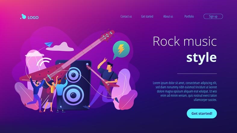
A picture is worth a thousand words, and this is still true when it comes to websites. Appropriate illustrations or images can allow users to quickly form an opinion on your business, what services/products you provide, and entice them to stay on a page and browse further.
2. Typography
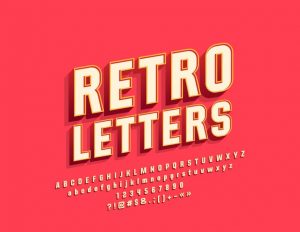
One of the oldest design elements in web design is typography, which focuses purely on the layout, type, size and colour of font. While this seems relatively straightforward, it used to be quite an arduous task with developers, exploring 100s of combinations to choose a font that matched a companies brand.
Today however, with the growth in variable fonts, it means that developers are able to manipulate fonts with greater ease and adjust aspects such as boldness, width and slant. It also allows the overall design process to be streamlined as variable fonts allow for all variations of a particular typeface to be submitted in one file.

3. Rise of 3D Design elements
Gone are the days of wordart. Today design elements are constantly evolving, enticing visitors to explore your brand and website. This evolution has been linked to the increasing development in technology, such as smartphones, which have allowed for more user interactive (less static) webpages. One such evolving element is the introduction of 3D design elements (both static and moving) which involves using images with a greater depth and an almost tactile feel to them. But while this trend has been on the rise, the importance of being careful in terms of complexity is important as utilizing a complex 3D design in your website can result in a slower load speed, leading to poor user experience.
4. Bright Colours, used Sparingly
With the rise in popularity of darker themes over the last couple of years, brighter colours and gradients are increasingly valued for their ability to accentuate CTA elements and drive home key messages to visitors. However, the use of bright colours only works when utilised sparingly, otherwise it can be too overwhelming for the user.
5. Gradients
Gradients are still as popular as ever. This melded look also allows for images to have a greater look of depth, further highlighting them in the overall design.
Gradients are also used to accentuate images, such as when Spotify utilised duotone gradients to highlight certain playlists in relation to moods.

If you do want to update the look of your website, but are lost amongst all the UI design jargon, then you’ve come to the right place. Contact one of our friendly team members at Redline Digital and we can help get you on track to fresher and beautifully designed website.

