With the holiday season just around the corner, now is the time for businesses to get involved in the Christmas spirit, and leverage this period to effectively generate interest and most importantly, sales.
With all that’s happened this year, people have become far more comfortable with purchasing online, which makes a business’s website / virtual storefront even more crucial.
Let’s explore a few ideas to incorporate into your website for the holiday season:
Add Holiday Themes
Everyone wants to get into the holiday spirit and it helps to make a customer feel welcome when a website mimics this feeling. This doesn’t necessarily mean drastically overhauling the look of a website or going to over the top with christmas themes and colour. Websites can include christmas/holiday based targeted content and design without negating the original colour scheme and layout. Allowing for customers to still make the connection between your business, and the holidays.
Improving Website User Experience
While design is important, one of the most important aspects to in improving a website is are changes that will benefit the user. Here are some tips for improving website UX:
- Make sure your website is optimised for mobile as search engines are moving towards mobile first indexing due to overwhelming popularity of searches through mobile devices.
- Simplify the navigation menu and make it easy to access for users to search your website and find key products or services.
- Examine and optimise the visual factors for best possible usability including fonts, content and layout. Heatmaps and google analytics can be highly beneficial in this instance to determine which areas of your website have the most amount of traffic.
- Check and ensure maximum website site load speed, as this can have a huge positive effect on customer satisfaction. To ensure this, it is also wise to check the server your website is running is equipped to deal with the influx of holiday traffic.
Leverage New UX & UI Designs
It’s also the perfect opportunity for businesses to start exploring some new design trends coming into the new year. The most effective way to carry this out is through implementing one or two elements at a time to allow for accurate testing. Below are just some of the new trends that have become popular for UX and UI design this year:

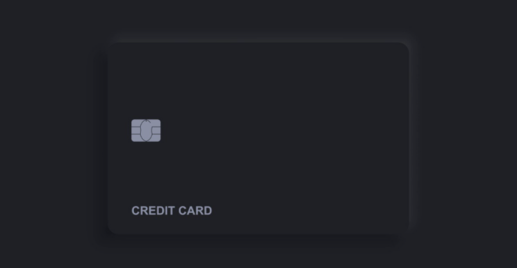
Neumorphism: While it sounds complex, neumorphism focuses on utilising flat design accompanied with highlighting, shadows and glows to transform imagery into realistic 3D objects. These realistic designs can be utilised to accentuate specific images or simply to add greater depth into a website’s aesthetic.
Animations: People are more likely to stay on pages that keep them engaged, and animations are a perfect way to achieve this. While they can be simple, the animations themselves add a level of complexity and interactivity to your website.
Microinteractions: This design element has been particularly useful in the mobile environment and focuses on providing buttons and other action points (usually linked to products) that streamline the user experience. In the past they have been utilised purely on social media platforms. But there are also options for businesses to leverage them in their own websites for example, providing a share button so customers can show different products/services to family and friends.

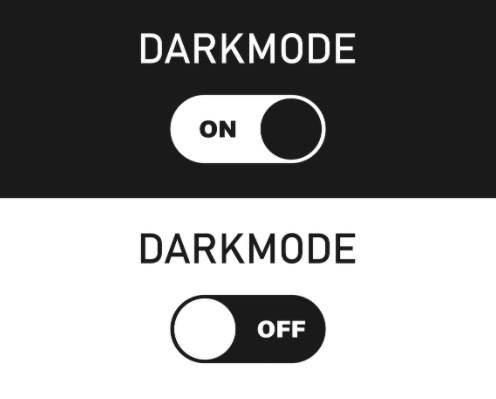
Dark mode: Businesses have been experimenting with the option of a dark mode. This is where websites can be shown in both a dark or light option depending on user preference. Alternatively many businesses have simply opted for a purely dark website layout. The darker colours have been found to showcase a more modern aesthetic and allow for other design elements to be highlighted in greater detail.
There are many options for businesses looking to improve their website during the holidays, which can range from technical to aesthetic. These elements all need to seamlessly integrate with one another, while providing the best possible experience for users. It is recommended that a web design company is utilised to ensure the premium design can be achieved without missing any key aspects of a website.
